Teaching Slides Design (2): Free Licensed Fonts for Presentations (Updated 2022/01/15: Added Kosugi)
The fonts chapter of the Teaching Slides Design series. Learn why PMingLiU and DFKai-SB are poor choices for presentation slides, plus a curated list of free and paid licensed fonts suitable for teaching presentations.
For all online teaching resources, visit the Online Teaching Resource Hub — interactive PowerPoints, Google tools, and more.
About Fonts
For a general introduction to the Teaching Slides Design series, see the first post: Teaching Slides Design (1): Information + Design = a Beautiful, Content-Rich Gift
Many people, when building slides, rely entirely on whatever fonts came pre-installed on their computer and have no idea where to find better options. This post brings together some excellent articles I’ve come across, covers a few things to keep in mind when choosing fonts for teaching slides, and recommends some fonts — mostly free, legally licensed ones [please don’t download pirated fonts!!!] — plus a handful of great paid options. Font design is ultimately not my area of expertise, so if I’ve made any mistakes, please let me know and I’ll correct them as soon as possible!
I highly recommend following Justfont Blog as well as their Facebook and Instagram — they regularly publish practical articles and are a fantastic entry point into the world of typography :D If you want to go deeper, I’d especially recommend the book 字型散步:日常生活的中文字型學 — there’s so much to learn from it!
Stop Using PMingLiU and DFKai-SB in Your Slides! — On Visibility
Because this point is important, I’m going to say it three times:
Stop using PMingLiU and DFKai-SB in your slides! Stop using PMingLiU and DFKai-SB in your slides! Stop using PMingLiU and DFKai-SB in your slides!
This isn’t a criticism of the fonts themselves — it’s about your audience.
There’s a simple answer and a complex one. The simple answer: PMingLiU was designed for documents read up close. The complex answer: PMingLiU’s “optical size” is not suited for presentations. — Justfont, Why PMingLiU Doesn’t Work for Presentations
Take a look at this image. From left to right: PMingLiU, Microsoft JhengHei, DFKai-SB:
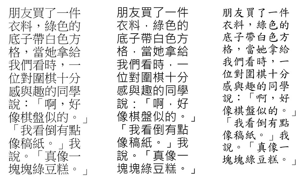
Step back a few paces and see which typeface remains legible from a distance. Justfont explains in their articles Why PMingLiU Doesn’t Work for Presentations and What if we had… an educational/official font beyond DFKai-SB? that neither typeface was originally designed for on-screen reading:
PMingLiU was designed for printed documents and for the low-resolution screens of older personal computers — both are “up-close” reading contexts. — Justfont, Why PMingLiU Doesn’t Work for Presentations
DFKai-SB has strong stroke contrast and tapered terminals, which create a flickering effect on high-resolution screens and make it tiring to read. — Justfont, What if we had… an educational/official font beyond DFKai-SB?
So this is entirely about the audience, not personal preference. Anyone who’s sat through a long lecture or conference where the speaker used high-contrast typefaces knows exactly how exhausting that can be on the eyes.
This consideration relates to what type designers call visibility. If you’re curious, Justfont has a great piece on it: Is PMingLiU Just Ugly? Wayfinding at Taoyuan Airport and Design Thinking About Typefaces.
Another Thing to Consider: Fonts Have Personality!
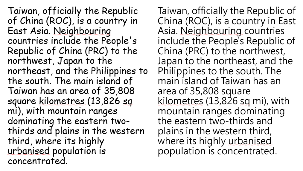
There’s another important dimension to font choice — every font has a personality, or in other words, a distinct feeling it conveys. Here’s another example: which of these two slides looks more professional to you? Both use sans-serif fonts, but Comic Sans MS (left) and Microsoft JhengHei (right) feel completely different.
In my own slides, I tend to reach for fonts that feel more “grounded” or “elegant” — except for game activities, where I’ll go for something more “fun” and “lively.” Of course, this is subjective, but the difference is real. Font choice matters.
Recommended Fonts for Teaching Slides
With those concepts in mind, here are some fonts I’d recommend for teaching presentations, along with examples of their style. (The idea of showing font samples comes from Justfont — see this post.) All of these are legally licensed; I’ll specifically note the paid ones.
You may also find these resources helpful:
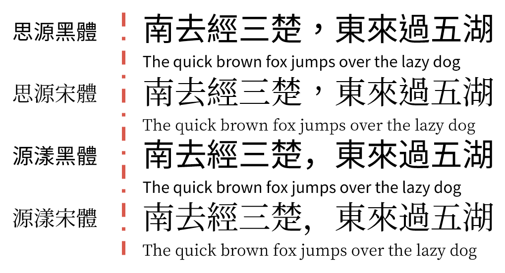
Source Han Sans: Adobe and Google collaboration; supports Japanese, Korean, Traditional Chinese, Simplified Chinese, and seven weights (large file size) Source Han Serif: Adobe and Google collaboration; supports Japanese, Korean, Traditional Chinese, Simplified Chinese, and seven weights (large file size) (Both are also available via Google Noto Fonts as “Noto Sans CJK tc” and “Noto Serif CJK tc”)
GenYog Gothic: by But Ko; seven weights (Regular shown); also supports Tâi-lô and POJ romanization; Bopomofo version available GenYo Mincho: by But Ko; seven weights (Regular shown); also supports Tâi-lô and POJ romanization; Bopomofo version available
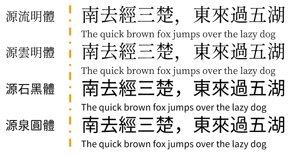
GenRyu Mincho: by But Ko; seven weights (Regular shown); also supports Tâi-lô and POJ romanization; Bopomofo version available GenWan Mincho: by But Ko; five weights (Regular shown); also supports Tâi-lô and POJ romanization; Bopomofo version available GenSeki Gothic: by But Ko; five weights (Regular shown); also supports Tâi-lô and POJ romanization; Bopomofo version available GenSen Round: by But Ko; six weights (Regular shown); also supports Tâi-lô and POJ romanization; Bopomofo version available
Taipei Sans TC: JT Foundry; three weights Glow Sans: Project Wêlai; includes variants like Wide Huninn: Justfont Jason Handwriting: by Jason Yu; strongly handwritten feel, not recommended for body text; example shown is Handwriting 1
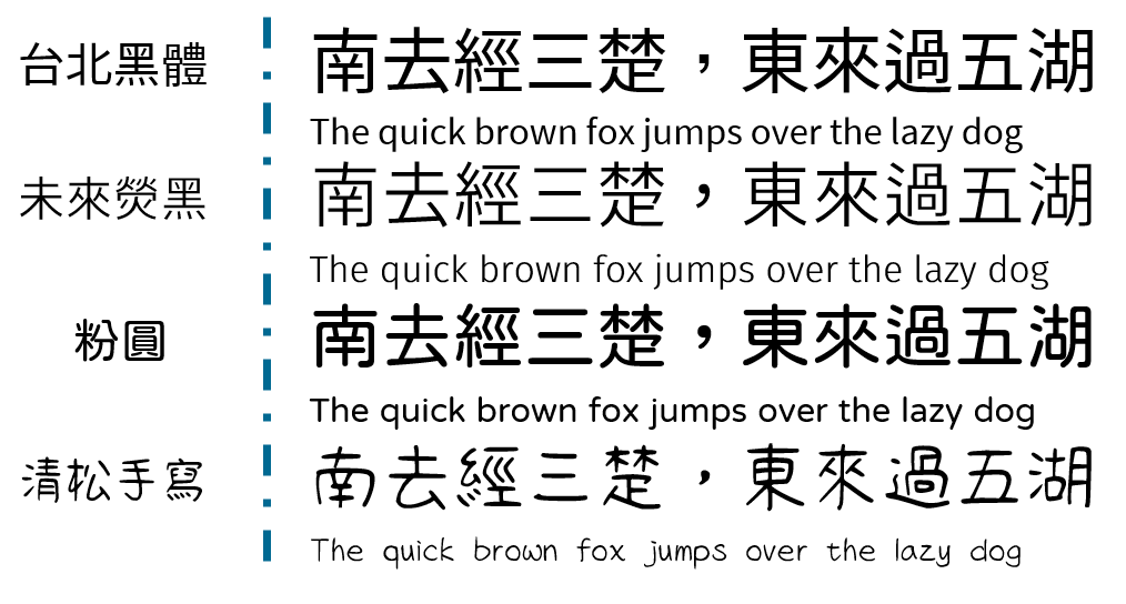
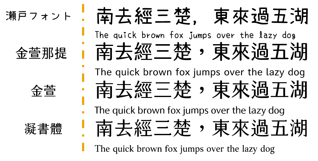
Seto Font: by Kanizawa Norio; strong handwritten feel, not recommended for body text; Japanese font — watch for missing characters Jinxuan Latte [Paid]: Justfont; comes in nine sweetness levels; example shown is half-sugar (suitable for body text and subheadings) Jinxuan [Paid]: Justfont; comes in nine sweetness levels; example shown is half-sugar (suitable for body text and subheadings) Cream Font [Paid]: Justfont; combines the characteristics of regular script (楷體) and Ming-style (明體)
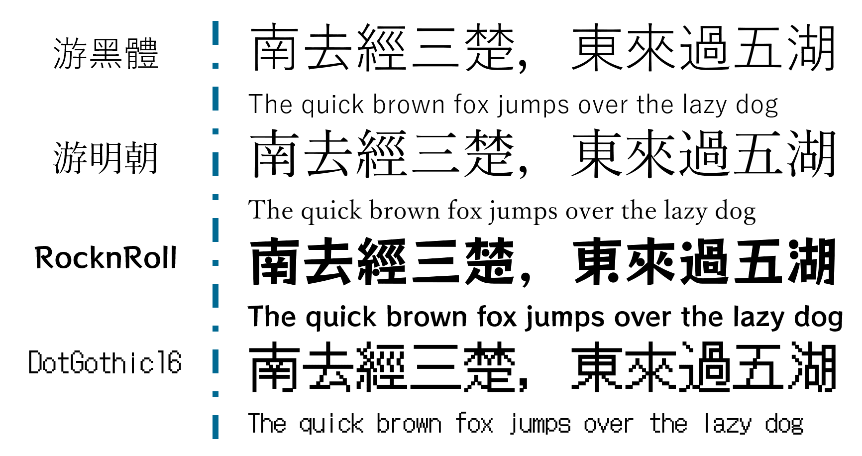
Yu Gothic: Jiyu Kobo; built into Windows 8.1 and above; Japanese font — watch for missing characters Yu Mincho: Jiyu Kobo; built into Windows 8.1 and above; Japanese font — watch for missing characters RocknRoll: Fontworks; Japanese font — watch for missing characters DotGothic16: Fontworks; Japanese font — watch for missing characters
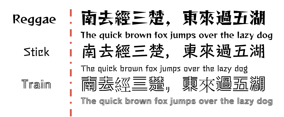
Reggae: Fontworks; strong personality, not recommended for body text; Japanese font — watch for missing characters Stick: Fontworks; strong personality, not recommended for body text; Japanese font — watch for missing characters Train: Fontworks; strong personality, not recommended for body text; Japanese font — watch for missing characters (there’s actually a missing character in the example image XD)
Bopomofo (Zhuyin) Versions
GenYog Gothic, GenYo Mincho, GenRyu Mincho, GenWan Mincho, GenSeki Gothic, and GenSen Round all have Bopomofo versions available for download (incredibly thoughtful!) — I won’t go into detail here, but here are three more:
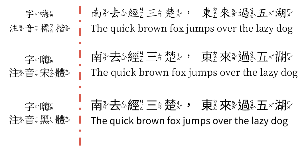
Bpmf Kai, Bpmf Sung, and Bpmf Hei — all downloadable here: For polyphonic characters (破音字), download Bpmf_VSIME to choose the correct pronunciation!
Taiwan Standard (台標) Version
Kosugi (芫荽): currently in public beta — see this post for details; includes Taiwan Mandarin and Taiwanese versions 🙂
Wrapping Up
There are plenty more great fonts out there, but this covers the essentials. My general advice is to prioritize fonts that have good Traditional Chinese support — Japanese fonts and strongly handwritten fonts are better suited as decorative accents.
A few things to keep in mind when using fonts:
- Overall pairing: Fonts have personalities — classical-style content pairs well with Ming/serif styles; modern or design-forward content suits gothic/sans-serif
- Audience readability: Highly stylized fonts or those with extreme stroke-contrast variation aren’t good for body text — they get tiring to read
- Never have missing characters: No matter how beautiful a font is, the moment it can’t render a character, it’s out. This is exactly why I don’t recommend Japanese fonts as the main font for Chinese-language slides — missing characters are just too common
- Consistency throughout: Whatever font family you choose, stick with it across the whole deck — switching fonts every slide or every paragraph is visually exhausting
- Use weights intentionally: Many of the fonts above come in multiple weights, which are suited to different roles — Regular works well for body text, Bold for headings, and so on
- Don’t use pirated fonts: Creating a typeface takes enormous time, labor, and money. Please respect the copyright. Nearly all the fonts listed above are free — more than enough for teaching use
- Commercial use: These fonts are listed for personal use. If you need to use them commercially, go back to the original source and check the license — using them outside their licensed scope is illegal
- Font compatibility: If you’re presenting on a different computer, make sure to embed your fonts in the file or bring them along — having your carefully designed slides revert to default fonts is genuinely heartbreaking T_T
My personal go-to is Jinxuan — it’s genuinely beautiful, and I regularly have audience members come up to me after sessions asking what font I used XD. Highly recommend picking it up if budget allows! For simpler situations, Microsoft JhengHei works perfectly well — clean, readable, and with thoughtful layout it can look quite polished too.
I hope this was helpful! Feel free to leave a comment anytime with questions or to share your own recommendations.
Thanks for reading :D
If you enjoyed this post, feel free to click the coffee button in the lower right to support us and give Lottery a can 🐾
Comments