Teaching Slides Design (1): Information + Design = a Beautiful, Content-Rich Gift
The introductory post of the Teaching Slides Design series. A brief look at why slides matter in teaching, with an overview of the two key dimensions — content and design — and how to make them work together.
For all online teaching resources, visit the Online Teaching Resource Hub — interactive PowerPoints, Google tools, and more.
About Slides
Teaching without slides feels like something’s missing these days. I’m not a professional slide designer by any means, but when I shared some of my game-based interactive presentations recently, a few teachers asked about my font and design choices. So I thought I’d share a few of the things I pay most attention to when designing slides. Consider this a starting point, not a definitive guide.
This post also draws on some wonderful resources from people who know far more than I do — I really recommend reading these:
- Why PMingLiU Doesn’t Work for Presentations (Justfont Blog)
- #Midterms #DoYouKnowSlides (Justfont)
- Making Visuals More Than Pretty — Information Design Thinking! (Hahow course)
Teaching Slide Design Is Like Wrapping a Gift
From a teaching perspective, slides are there to support your instruction — not replace it. They help you stay on track, maintain the logic of the lesson, keep the pace organized, and help students grasp concepts. They are absolutely not for showing off, and they’re not a substitute for a textbook. So please: don’t paste walls of text onto slides and read them aloud (students can read faster than you can speak), and don’t fill them with random animations that serve no purpose.
If you agree with that framing, then slide design naturally follows from it. I find it helpful to break slides into two core dimensions:
- Content — the gift itself
- Design — the gift wrapping
Think of a slide deck as a gift. When a student first receives it, the first thing they see is the wrapping — that’s the design. Once they unwrap it, the actual contents are the content — what they’ll actually learn in the class.
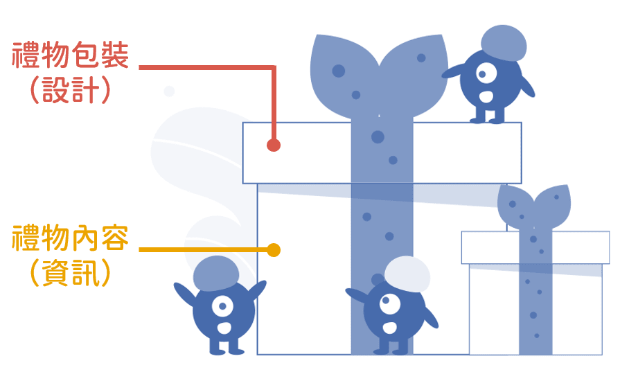
Imagine receiving a beautifully wrapped gift, only to find a single tissue inside. Disappointing, right? XD On the flip side, if the wrapping is a total mess, even a wonderful gift inside can cause a moment of confusion. The teaching substance still lives in the content — but getting the design right can genuinely boost students’ motivation to engage. And trust me, when the design is done well, it actually accelerates how quickly people absorb information.
The Gift Wrapping — Design
Justfont highlighted six keywords for transforming slide layouts in their post:
- Distance: how far away the audience is from the screen
- Typeface: choosing the right font
- Color: appropriate color pairings
- Hierarchy: structuring levels of information
- Rhythm: font sizing and line spacing
- Convention: consistent punctuation and formatting
The first one — distance — relates to the context in which slides are shown (classroom projector, online screen, etc.). The rest are all design-related, but each serves the goal of improving how information is communicated (especially the fourth, hierarchy).
So what does effective information communication actually require?
The Gift Contents — Information
Teaching spans so many subjects and disciplines, each with its own expertise — I’m certainly not here to tell anyone how to teach their content XD But there’s one thing that matters across all of them: information architecture.
Have you ever been in this situation?
You’re at a fascinating talk, but the speaker drifts so far off-topic that you genuinely lose track of where you are in the argument…
And then they say:
“Oh, sorry — I got a bit sidetracked. Where was I again?”
I’ll be the first to raise my hand — that’s absolutely me XD Precisely because of that tendency, I’m very deliberate about marking where we are in the slides at any given moment.
A clear structure in your slides tells students exactly what they’re listening to at any point. They know how to ask questions. They know where to go back and review if they missed something.
Information has to have a clear structure, or the slides won’t be clear either. If I’m telling a story, unless I’m going for a non-linear narrative, I’ll follow the chronological thread. If I’m covering a chapter, I’ll start with section one and work through in order.
The practical step: outline your lesson content in advance.
Here’s what the architecture of this very post looks like (I like writing in Markdown XD):
# About Slides: establish why slides matter in teaching
# Teaching Slide Design Is Like Wrapping a Gift: introduce the main frame — slides as content + design
# The Gift Wrapping — Design: Justfont's six keywords
  - Distance
  - Typeface
  - Color
  - Hierarchy
  - Rhythm
  - Convention
# The Gift Contents — Information: why information architecture matters, with an example
# Wrapping Up: bridge to the next post
Once you have the structure, mark each section in the slides — with a chapter title, a color code, or a progress indicator — so you always know where you are.
If you’ve spent time on this site, you might have noticed that my content is organized by color:
- Yellow: ACG content
- Red: lifestyle content
- Blue: academic / teaching content
That way, readers always know at a glance which section they’re in and what kind of content they’re reading. (This post is blue, of course XD)
In future posts in this series, I’ll show how simple design choices can make information architecture visible and clear :)
Wrapping Up
You’re all experts in your own subject areas — this post is just me sharing a few thoughts on how I approach slide design. Coming up next, I’ll cover the free and paid fonts, illustration and background image resources, information architecture techniques, and color choices I use in my teaching slides :)
I hope this was helpful! Feel free to leave a comment anytime with questions or to share your thoughts.
Thanks for reading :D
If you enjoyed this post, feel free to click the coffee button in the lower right to support us and give Lottery a can 🐾
Comments